The first watermark I ever made was for my cousin’s studio, years before SpotMe. It was his signature in gold script, about a third of the photo wide, dead centre, at full opacity. He loved it. A week later the bride’s mother phoned him and asked, very politely, if she could have the photos “without that sticker on her face”.
She was right. We’d made the watermark the most visible thing in every photo.
A good watermark does one job: when a guest’s photo ends up on Instagram or in the family group, people can tell who took it. It shouldn’t compete with the bride. Here’s how to get that balance.
First, what a watermark is not
A watermark won’t stop anyone from using your photo. Anyone with a phone can crop a corner, and nobody is going to court over a cousin’s Instagram post. Think of it as a signature, not a lock.
That changes how you design it. A signature needs to be readable and tasteful. It doesn’t need to cover the subject’s face to be effective, because the people who would remove it were never going to pay you anyway. The people who matter, the guest’s friends wondering “who shot this?”, only need to see it.
Placement
Bottom right is the default for a reason. Eyes finish there when reading a photo, and it’s rarely where the subject is.
Bottom left when the subject is on the right. Many portraits are composed with the bride off-centre. Move the mark to the empty side.
Never the centre. Not even faintly. A central watermark makes every photo look like a stock image preview, and guests won’t post it.
Keep it a little away from the edge. About 3 to 5% of the width in from the sides and bottom. Two reasons: it looks deliberate rather than jammed into the corner, and it survives cropping. A portrait photo posted to Instagram gets cropped from 2:3 to 4:5, which trims the top and bottom. A watermark hugging the bottom edge can disappear in that crop.
Size
For a logo, around 12 to 20% of the photo’s width works for most studios. A wordmark (your name in letters) can be a little wider because it’s thinner.
The mistake I see most often is judging size on a 27-inch monitor. On a big screen, 12% looks tiny. On the phone where guests will actually see it, it looks right. Always check your watermark on a phone before deciding.
Opacity
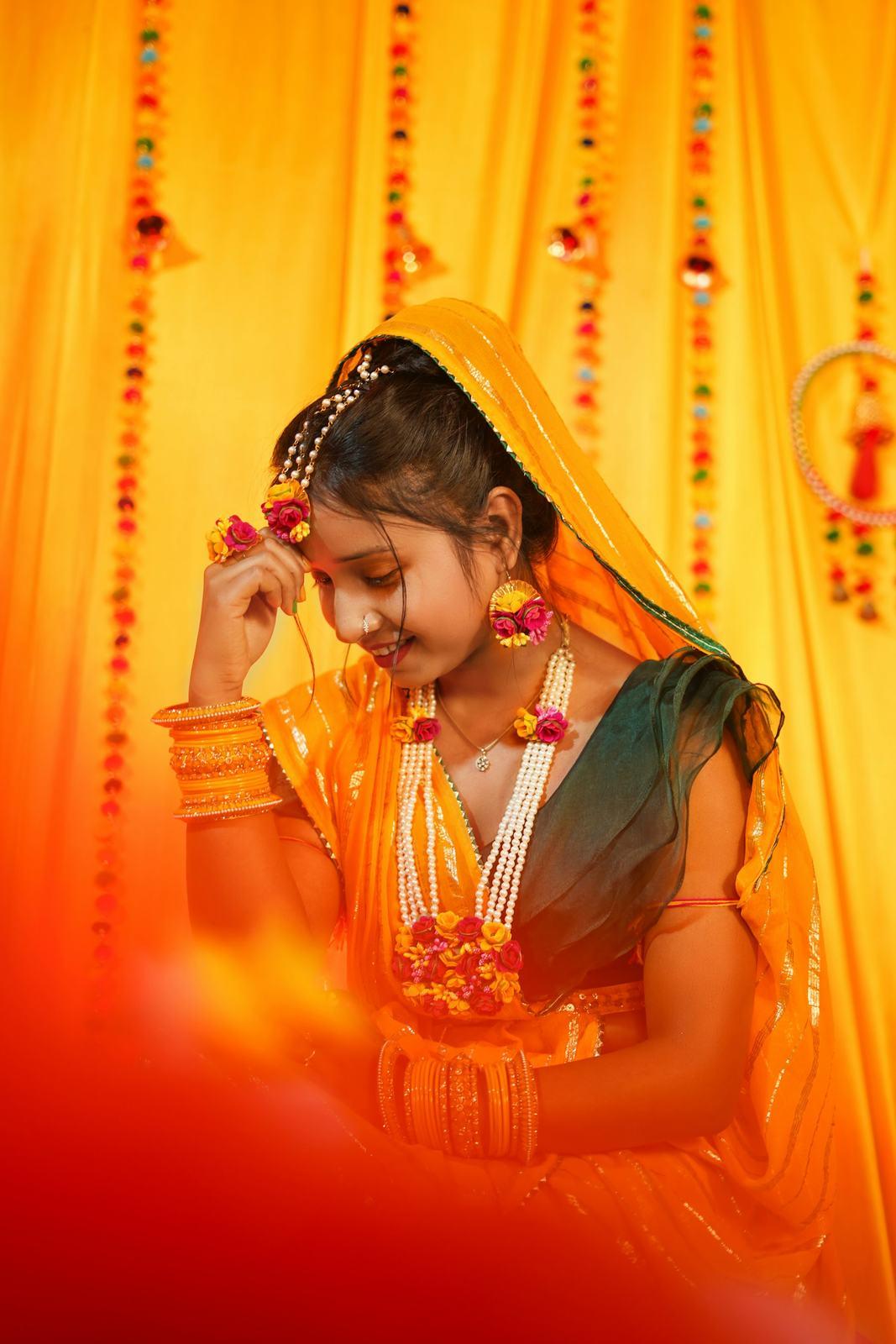
Somewhere between 50% and 70% is the comfortable range. Lower than 40% and it vanishes on busy backgrounds like a marigold-covered haldi stage. Higher than 80% and it starts to feel like a sticker.
The colour problem nobody plans for
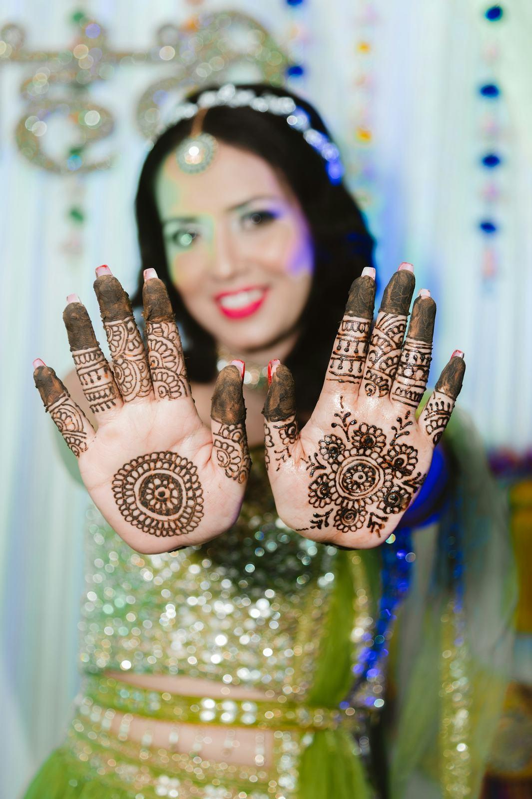
A wedding isn’t one lighting condition. The haldi is bright yellow and white. The sangeet is near-black with purple LEDs. The reception might be pink florals and chandeliers.
A black logo disappears in sangeet photos. A pure white logo disappears on a white haldi backdrop. The version that works across the whole wedding is usually white with a very soft dark shadow or outline. It reads on dark photos because it’s white, and on bright ones because of the shadow.
Try it on a photo here, and drag the opacity up and down to see where it stops being a signature and starts being a sticker:

Balanced. Readable on a phone screen without taking over the photo.
There’s also a standalone watermark tool if you want to try your own logo.
The file: PNG with transparency
Your watermark file should be a PNG with a transparent background. A JPEG logo can’t be transparent, so it brings a white (or black) rectangle with it, and every photo gets a little box in the corner.
How to check: open your PNG on a dark background. If you see a white box around the logo, it isn’t transparent. Ask your designer for a version “with a transparent background, white logo” and they’ll know exactly what you mean.
Make it big enough, too. Your watermark is drawn on full-resolution originals, not just phone copies.
Logo or text?
| Logo or monogram | Studio name as text | Logo plus name | |
|---|---|---|---|
| Looks elegant | Usually | Depends on the font | Usually |
| Readable on a phone | Only if people already know it | Yes | Yes |
| Helps a stranger find you | Rarely | Yes | Yes |
| Works small | Monograms do, detailed logos don’t | Yes, with a clean font | Needs more width |
My honest view: a monogram is lovely, but a guest’s friend in Mumbai doesn’t know what “RK” in a circle means. Your studio name, or the handle people would search, is what brings enquiries. If you love your monogram, use it with the name beside it.
Avoid thin script fonts. They look beautiful at 100% on your screen and turn into a squiggle at phone size, especially at 60% opacity.
When to skip the watermark
Not every photo should carry one.
- The couple’s album and print files. They paid for these. Their framed portrait on the living-room wall shouldn’t have your logo on it. Give them clean files for printing.
- Parents’ framed prints. Same reason. A 16 × 20 of the pheras for the bride’s grandparents should be clean.
- Commercial clients who paid for usage. A brand or a corporate client using photos in their own material will expect clean files.
- Vendor sharing. Decorators and makeup artists will ask for photos. A credit line in their caption tends to work better for you than a watermark they’ll crop out.
How this works on SpotMe
Your watermark is set once in your studio profile and is available on every plan, including Free. If you set one, it’s applied to both downloads guests get: the full-resolution original and the 2048 px mobile copy.
Two practical things. Set your watermark before you upload an event: each event keeps the watermark it had when its first photos were processed, so changing your logo halfway through a wedding won’t leave you with a mixed set. And if you want an event delivered with no watermark at all, remove it before uploading that event.
For the couple’s print files, the simplest approach is still the clean set on a drive in the album box, with the watermarked gallery for everyone else. That’s what most studios we work with do.
A starting point
If you want settings to start from today: white logo with a soft shadow, PNG with transparency, about 15% of the width, bottom right, 4% in from the edges, 60% opacity. Check it on a haldi photo and a sangeet photo, on your phone. Adjust from there.
More on branding your galleries, including your studio name and contact details, is on the branding page. For why the files themselves matter, see delivering photos without losing quality.